User interface and experience (UI/UX) are a crucial part of professional, in-depth API documentation. Think of your documentation as the UI/UX of your API, badly-designed or difficult to use documentation can do a lot to dull the shine of an amazing API.
A great developer experience means giving your users access what they want with minimal friction and allowing them to discover even more about your API beyond that. Taking the time to think about your content and how users interact with your documentation can take it to the next level.
Here are the most important design elements when it comes to to keeping your API docs looking great:
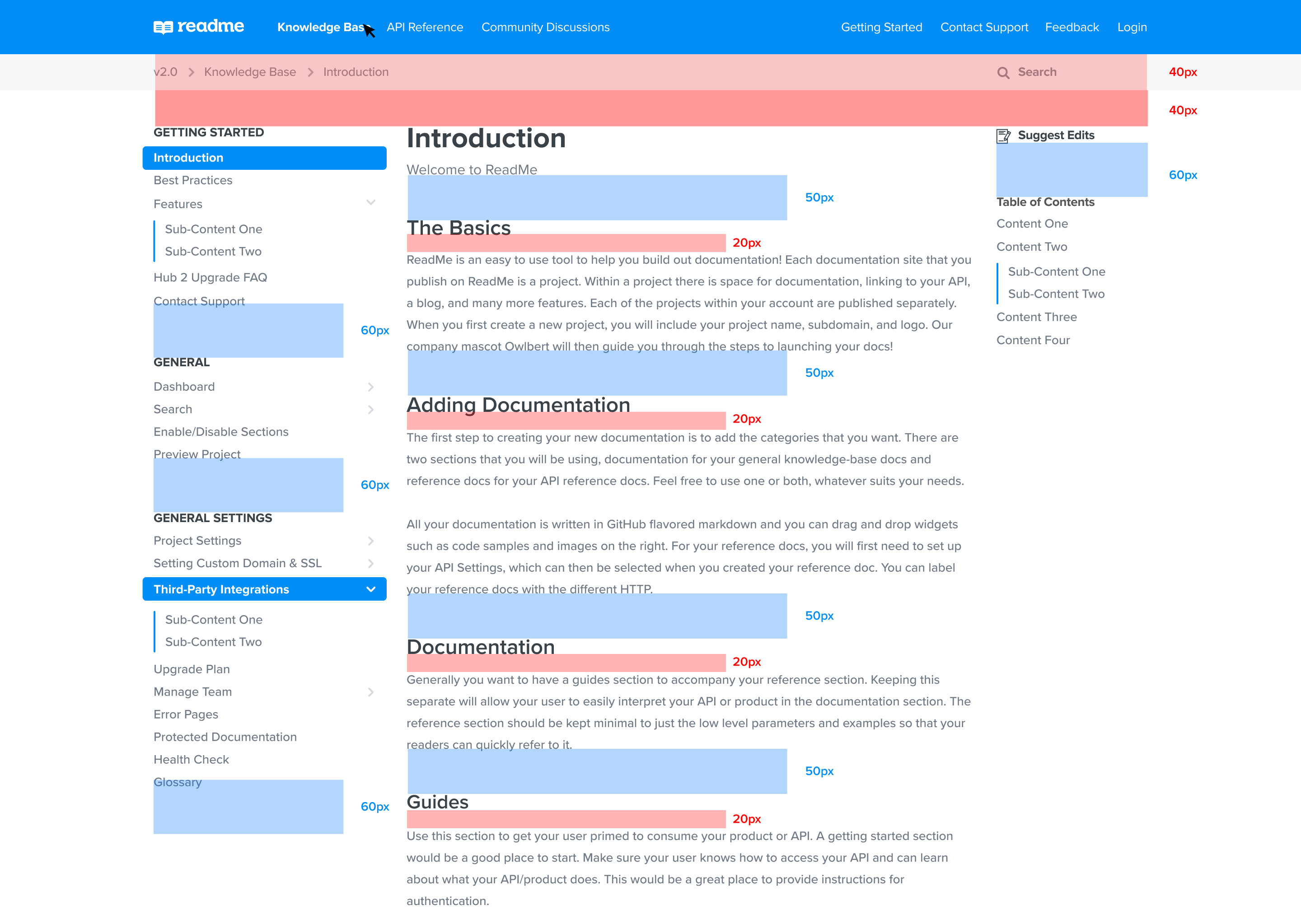
1. Global navigation
There are two main types of navigational UI to consider when creating documentation: global navigation, on the top of your website, and sidebar navigation, containing a list of your pages.
Global navigation is an easy way to lead users to:
- The different areas of your documentation (for example, API references vs. guides vs. your changelog)
- The search bar
- Signup and/or login buttons
…and anything else that you want users to have available to them at all times, regardless of where they’re at in your docs.
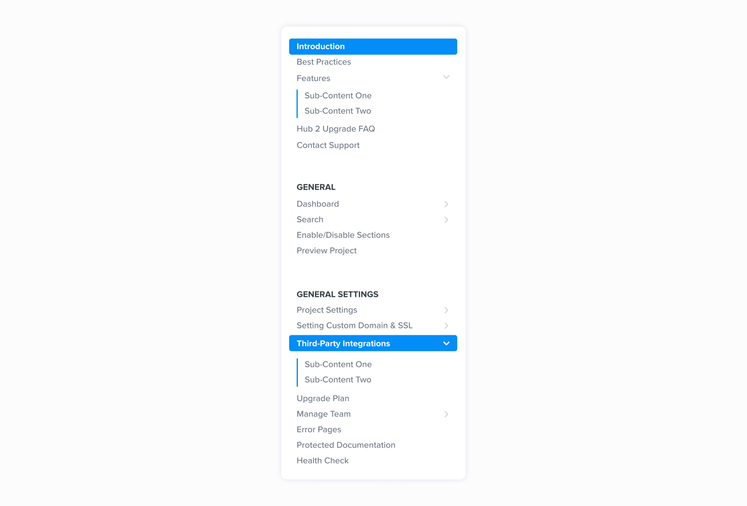
2. Sidebars
Sidebar navigation is a great place to give the user an overview of all the available content. Usually placed on the left, it typically has all of the pages within the documentation, ideally, grouped into easy-to-understand categories based on what users are looking for. Listing every page without any categorization is a recipe for an extremely tedious user experience.
Keep these things in mind when reviewing your sidebar navigation:
- Why certain pages are categorized together: Are they grouped together based on the user point of view, or your point of view as someone working on the product? It’s a good practice to have everything that a user will need to solve a specific problem (or use a specific feature) in one spot.
- What the categories of pages are named: Again, the category names should be easy to read and understand at a glance, grouping docs by feature or use case often works well.
- How the pages are sorted within the category: This seems obvious, but can be easy to overlook when you’re organizing a large amount of documentation. Make sure the pages are in the order that the user is likely to need them in, so they can move through the category without suddenly being confused or disoriented by information they don’t need (yet).
3. Spacing
This is the amount of white space you are setting within your documentation between interface elements and written content. Spacing directly relates to the readability of your content. To get started, consider vertical spacing between your content, and set a standard based on set pixel rules and type scaling, if possible.
As a good baseline, create your own system of large, medium and small spacing sets to follow between elements and text. Following a uniform baseline improves the legibility to a user. We’ve set this for you in our design themes, but you’re always able to create your own ruling.
4. Typography
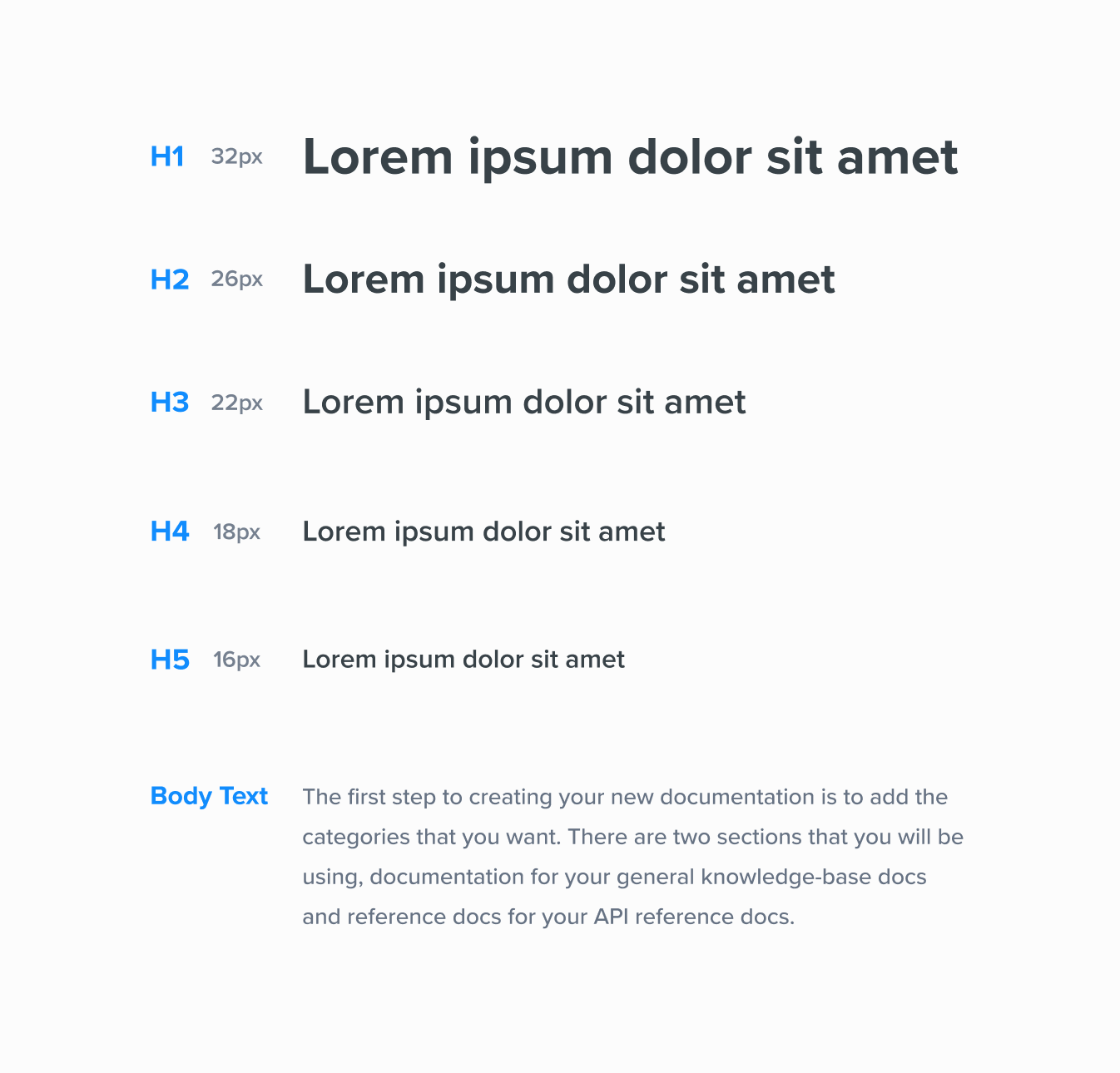
Learning the basics of typography and how it translates into CSS can make or break the type treatment of your documentation. Creating a clear typographic rhythm and scaling is a great base to get started with, and gives your documentation a professional feel.
Establish a clear H1–H5 and body text, this is critical in creating a base system for your project, since most documentation is written in an editor or created in markdown. What aesthetic or feeling do you want your type to have? Is it bold and weighted or light and airy? It’s your choice, and you can create your own style.
To learn more about typographic rhythms and scaling, check out Rhythm in Web Typography.
5. Interactive elements
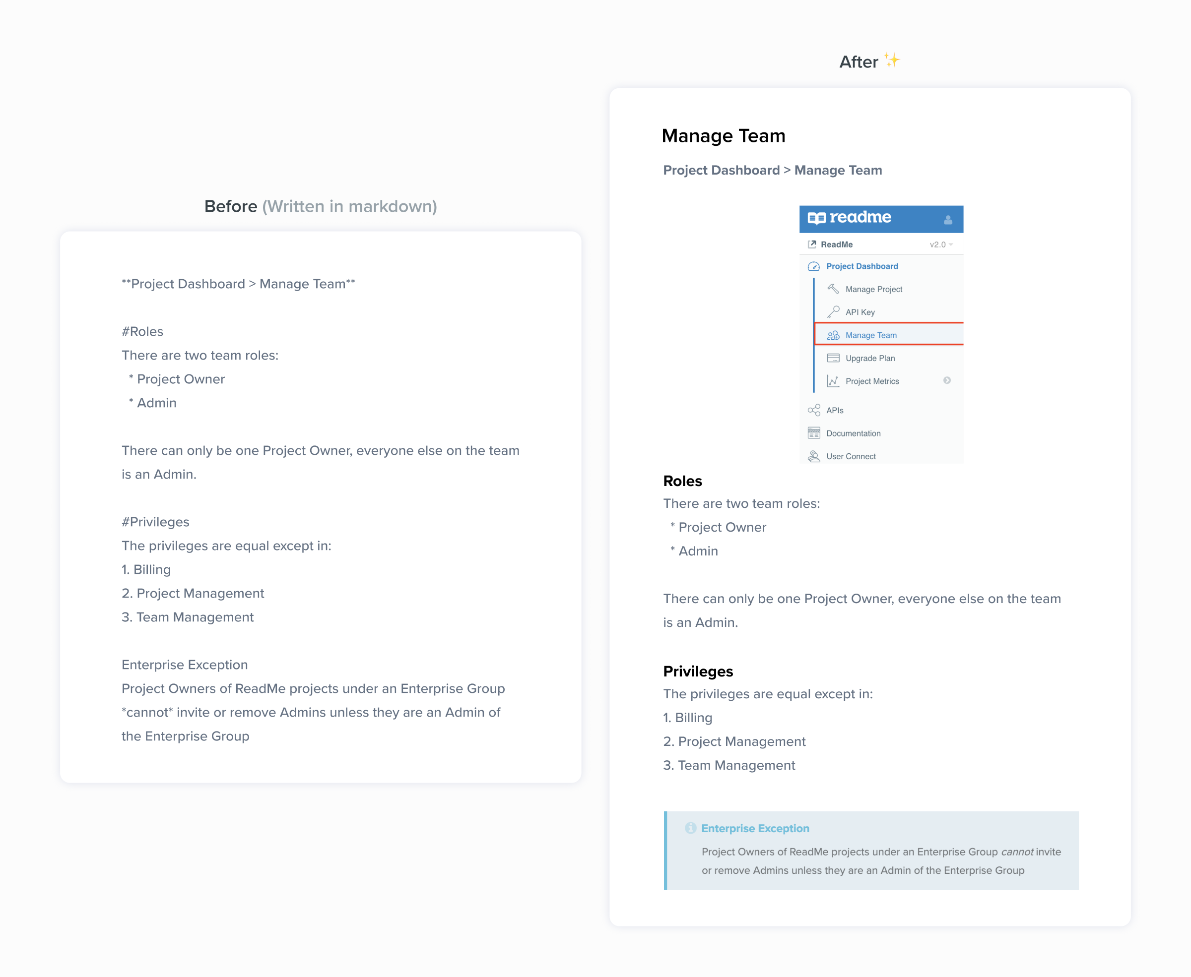
Having content beyond written text improves your developer experience and makes your documentation richer and easier to understand. These interactive elements may include:
- Code samples
- Callouts
- Tables
- Images
- Embedded content
- Custom HTML/CSS
Adding rich, interactive content and setting an information architecture standard allows you to establish a standard in your product documentation.
Going the extra mile to have more content available than just an API reference section can help developers get off the ground quicker. This all ties back to the amount of time in documentation a user interacts with and the understanding or readability of your content.
6. Calls to action

Do you want to promote your product or get a user to start an action faster? That’s when you use a call to action (CTA). These can be promotional (i.e. signing up for a demo or upgrading your product plan) or as simple as a link to another section of your documentation.
What differentiates a CTA from a run-of-the-mill link? CTAs are traditionally stylized as more of a “button,” as you can see above. However, a link that’s visually separated out from the rest of the content could also be considered a CTA. Examples of that visual separation might be:
- Bolding
- Italicizing
- Increasing text size
- Changing text color
- Putting the text on its own line
- Any combination of the above
When creating CTAs, think about the most important action for someone to take on a given page of documentation. That’s what your CTA should be.
7. Consistency: A keyword to remember
Having consistency throughout your documentation is a big part of creating a good developer experience. You can do this by:
- Having a unified clear visual style in your UI
- Having a standardized UX approach to pages and content so users know what to expect
- Grouping your information and writing
- Creating clear user pathways to your global and sidebar navigations
Thinking about the design and UI/UX within your documentation or project allows you to keep the experience developer-friendly. It’s a benefit to your overall product that users can understand your API value instantly and create something amazing with it. Setting standards early within your documentation fosters intention with what you’re creating, and presents the best version of your product.

